
Halelink is bridging the gap between patients and providers.
Public product in development: AI-assisted triage, verified booking, unified records, and clinician context in one trusted system.
Healthcare is still fragmented. Patients bounce between apps, portals, and phone calls, while providers lose time to admin-heavy workflows. I led product design for Halelink, a public health platform in development, to unify symptom triage, booking, and care context into one guided flow that feels calm, clear, and actionable.

I shaped the end-to-end product experience across patient and clinician flows, translating desk research into journeys, interaction models, and prototypes, then distilling the UI into a reusable design system ready for implementation.
UX Strategy
Prototyping
Design Systems
UX Engineer
Problem
People arrive in healthcare apps worried and time-poor. Many drop off because they don't know who to see, what their numbers mean, or where their information is stored.
Care was split across services.
Users were forced into multiple logins for appointments, lab results, and prescriptions.
Biometric data lacked context.
In concept reviews, raw biometric numbers repeatedly came up as confusing without explanation, interpretation, or a clear next step.
The experience didn't feel guided.
People couldn't start from symptoms to find the right type of care.
This was the opportunity: replace anxious decision-making with a guided path: AI triage that explains the “why”, clearer handoffs to booking, and a single place to manage health for the whole household.
Research
I used desk research and concept reviews to map patient journeys and clinician review workflows, pinpointing where uncertainty and admin load cause drop-offs and slow decisions.
Decision Paralysis
People couldn't tell whether they needed urgent care, a GP, or a specialist.
Data Overload
Charts showed numbers, but not meaning—no clear interpretation or next step.
Fragmented Care
Lab results and prescriptions lived in separate places, pushing people back to phone calls and screenshots.
Doctor Burnout
Clinicians reported too many clicks to understand history and context before responding.
Solution
I designed a connected care flow so patients can move from symptom to appointment with confidence, and clinicians can respond with the right context fast.
AI symptom triage recommends the right care path
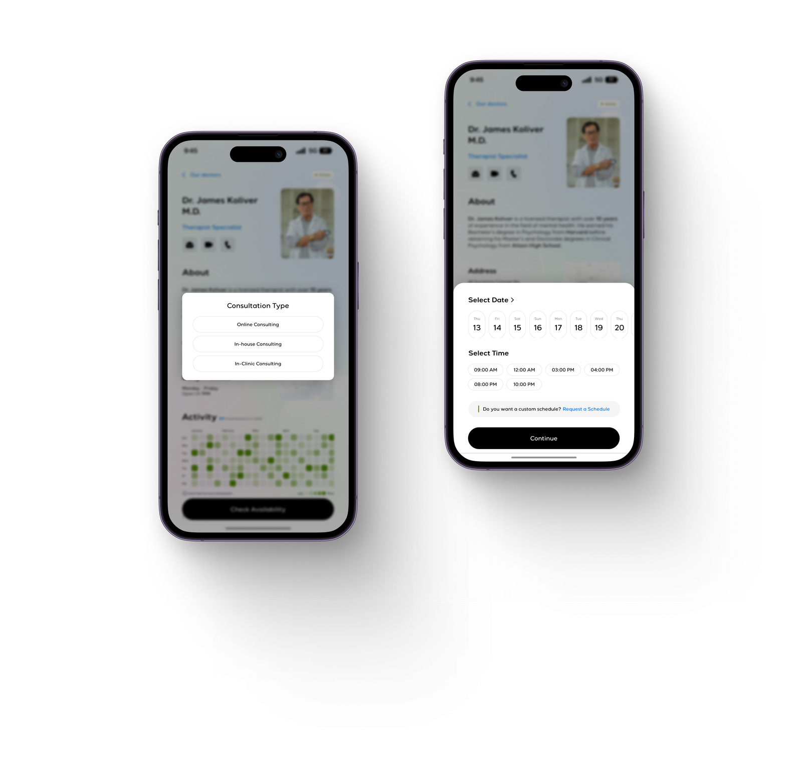
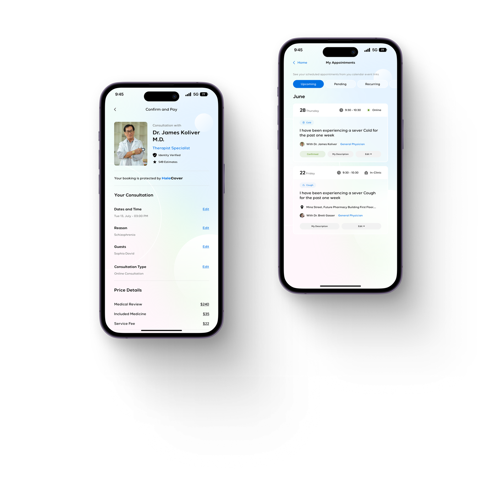
Search and booking with verified provider signals
Unified family profiles with shared history and records
Pharmacy refills and lab orders in the same journey
Clinician dashboard, real-time vitals and case history
Healthcare UX works when it reduces uncertainty. The product should translate signals into understanding, then move people to the next best action without making them feel like they're navigating a hospital system.
I focused on the handoffs: symptom → recommendation → booking → follow-up so patients feel supported and providers get the context they need.
Explainable triage that guides the next step
I paired symptom capture with plain-language explanations and a recommended path so users understand what to do next and why.
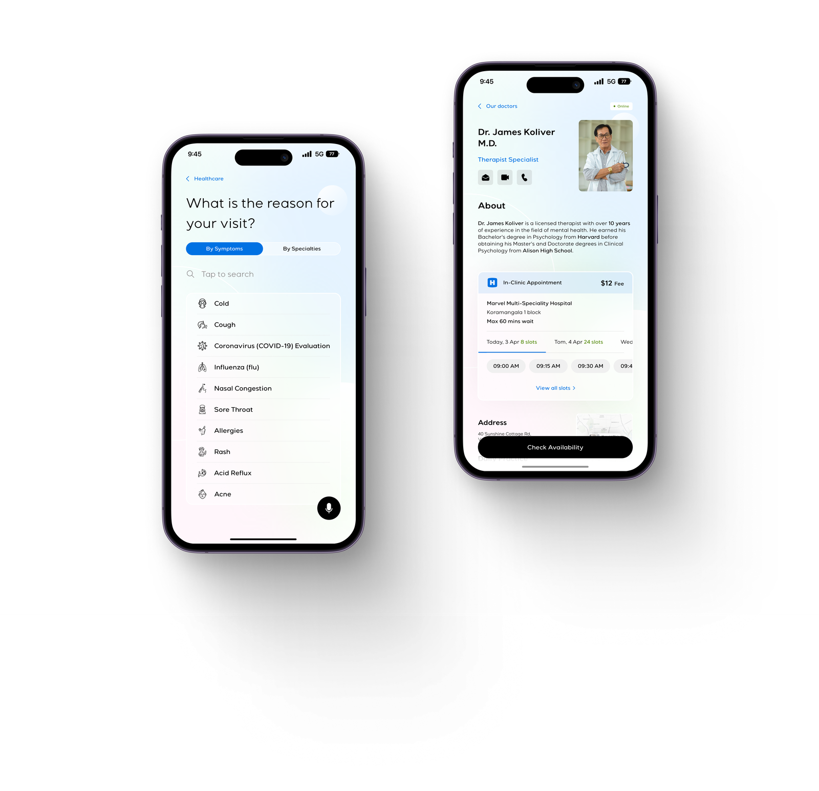
Booking that reduces choice overload
Routing and verification signals narrow options early so booking feels straightforward instead of overwhelming.
Clinician views that surface context first
I prioritized history, vitals, and the reason for visit so clinicians spend less time hunting for context and more time making decisions.
This project reinforced a simple lesson: AI only reduces stress when it's paired with explanation and a direct path to care. By designing triage, booking, and clinician context as one connected journey, I created a prototype that feels calmer for patients and more usable for providers even before shipping an MVP.
