
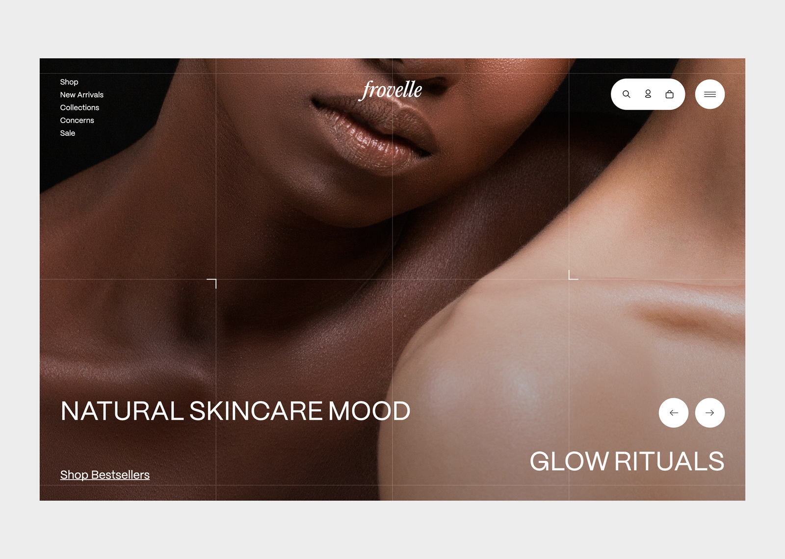
Turning skincare into a quiet ritual.
Designed to feel calm; built to convert with clarity, speed, and trust.
Frovelle is an e-commerce experience designed to feel unrushed: strong typography, soft structure, and interface details that disappear into the routine. I built the front-end with Next.js (App Router), styled-components, and Shopify Storefront API balancing brand atmosphere with real conversion flows.

I led the front-end build of Frovelle’s storefront crafting a high-end UI system, product browsing, product detail experience, and a cart flow that stays in context (drawer), then hands off cleanly to Shopify checkout.
Next.js (App Router)
React + TypeScript
UI engineering (styled-components)
Responsive layout systems
Accessibility (dialogs, keyboard flows)
Shopify Storefront API integration
Front-end developer
Problem
Skincare shopping often feels either overly “clinical” (feature lists, hard selling) or overly “editorial” (beautiful but not usable). Frovelle needed a front-end that preserves a luxury feel without sacrificing discoverability, product clarity, and checkout speed.
Clarity vs. atmosphere
Visitors should understand what a product is and why it fits without breaking the calm tone.
Context switching kills momentum
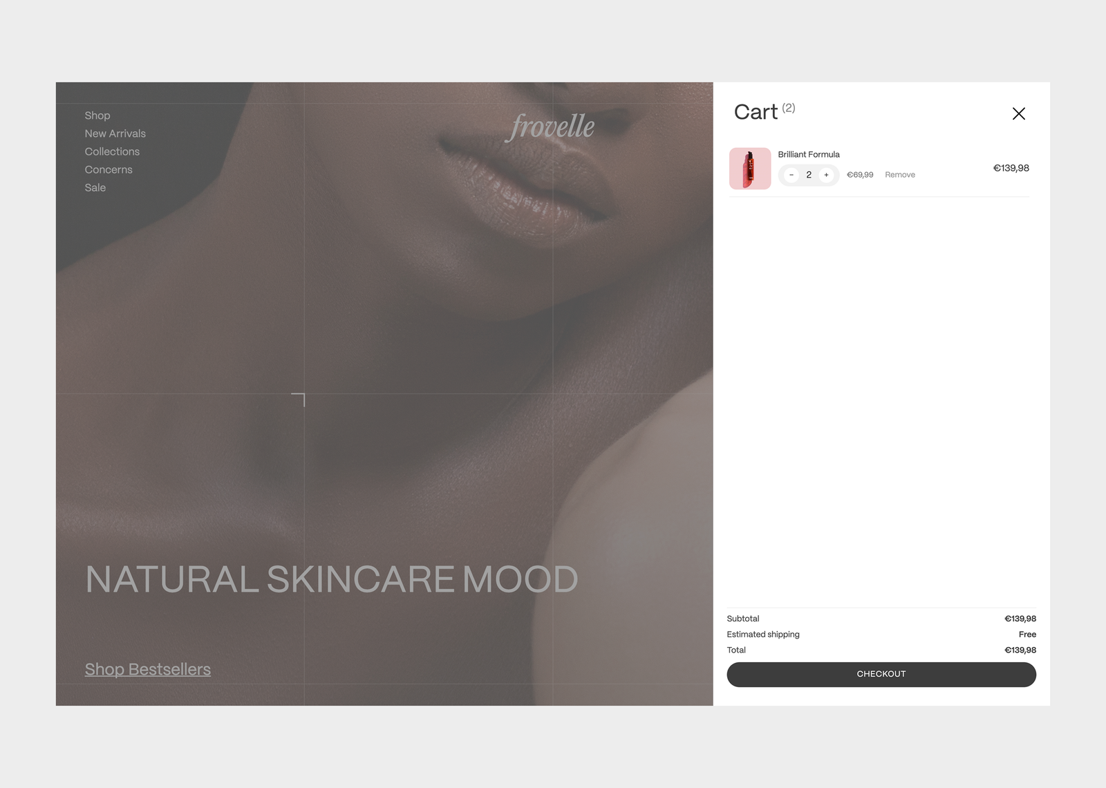
Traditional cart pages pull users away from browsing. Frovelle needed a cart that stays present and fast.
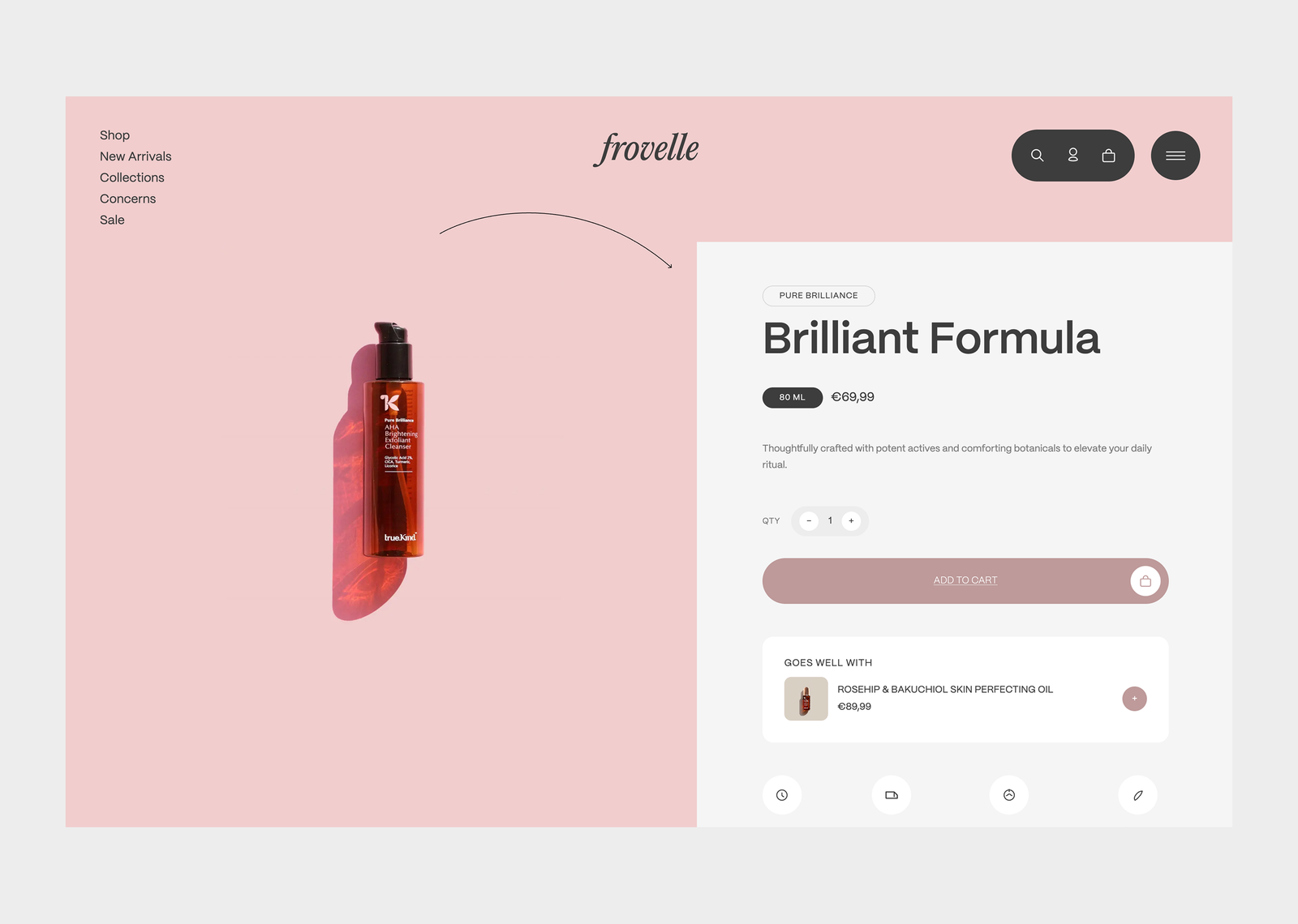
Product pages must do more than look good
Users need price, size, quantity control, trust signals, and “what pairs well” cues immediately.
Checkout must be reliable
The UI can be custom, but the final purchase flow needs the safety of Shopify’s checkout.
I clarified what Frovelle stands for at a glance, surfaced trust thoughtfully, and created a focused journey from browse to buy.
Research
Instead of treating this like a “marketing website,” I approached it as an interface system: how quickly can a user scan, choose, and commit while the brand still feels quiet? I mapped the main journeys (browse → product → cart → checkout) and designed front-end interactions to remove friction at each step.
Unclear next step
Users land, scroll, admire and still don’t know what to do first.
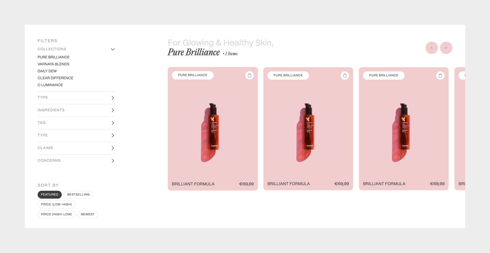
Weak product comparison
Product lists often hide what matters (category, price, size) until too late.
Cart friction
The cart is either too heavy (page navigation) or too light (no edit controls).
Trust missing at the decision moment
Returns, shipping, and ethical claims often sit in footers far from “Add to cart.”
Solution
I built a front-end that behaves like a ritual: minimal steps, clear hierarchy, and micro interactions that guide without shouting. The result is a Shopify powered storefront with a custom UI layer fast browsing, strong product pages, a cart drawer that keeps users in flow, and a checkout handoff that’s dependable.
Full-viewport hero with a clear CTA
Server-driven collections
Product page built for decision-making
Cart drawer instead of cart page
One-step checkout redirect

I treated every interaction as a moment of trust: the UI should feel stable, intentional, and fast so the user never questions what happens next.
I designed the flow so users can move from curiosity to checkout without losing the brand’s quiet tone.
A product hero built like a layout system
The product page uses a split-grid layout with a floating right panel, designed for scanning: category, price, size, and action are never buried. Accent color is derived from the product’s collection to keep the UI cohesive across the catalog.
Cart Drawer: edit without leaving
The cart is a slide-in drawer with an overlay users can adjust quantity, remove items, and understand totals instantly. It keeps browsing intact and reduces “where was I?” moments.
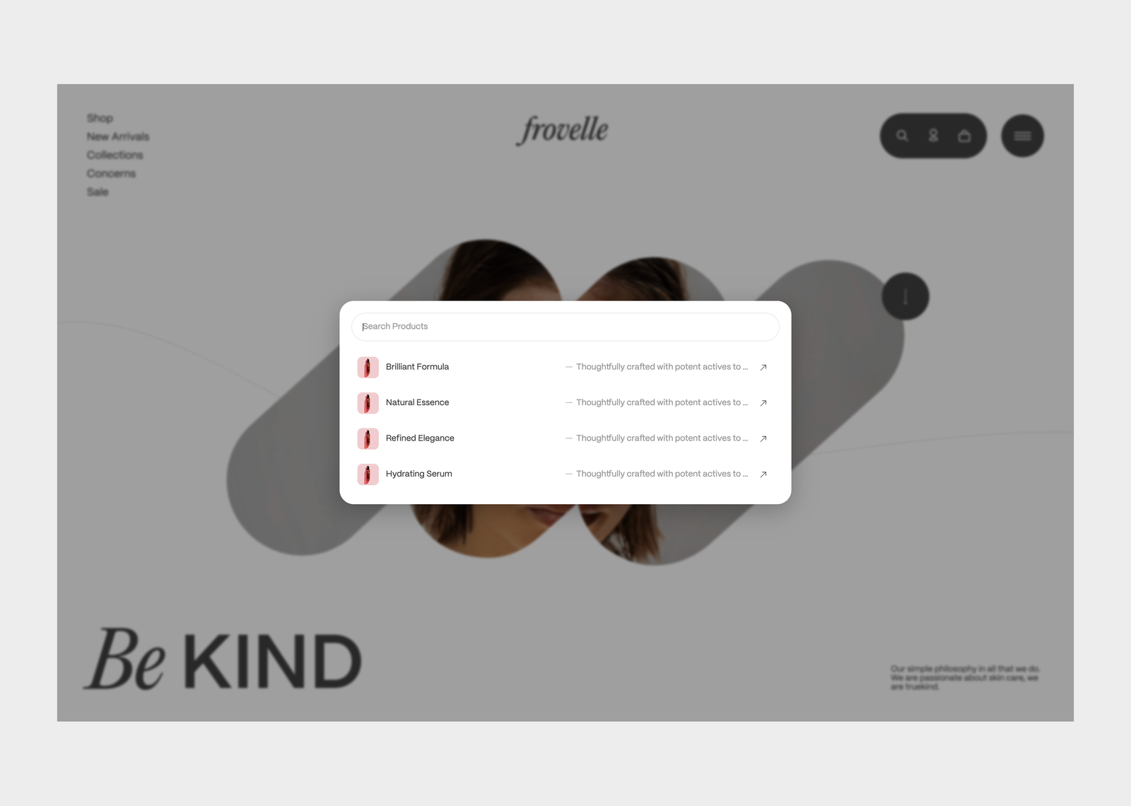
Search that respects speed + keyboard
Search is a modal designed for short intent: type → skim → enter. It supports Escape to close and Enter to open the top result, so the interface stays fast for power users.
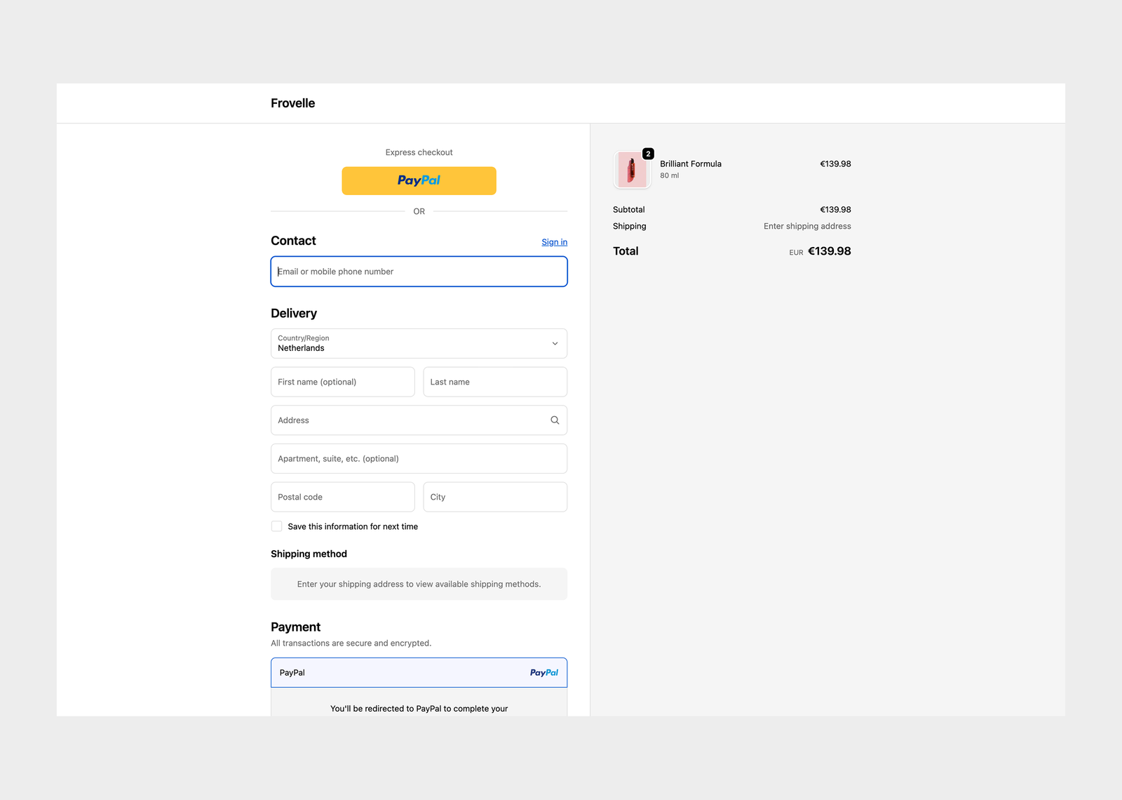
Shopify checkout handoff (custom UI, reliable payment)
The front-end creates a Shopify cart via an API route, then redirects users to Shopify checkout. This keeps the brand UI custom while ensuring the transaction is handled by Shopify’s proven checkout experience.
I refined the front end to feel quiet, fast, and confident using Next.js, styled‑components, and the Shopify Storefront API. Search is instant, the cart drawer stays lightweight, and overlays keep focus without freezing the page. The result is a smoother path from browse to checkout while preserving Frovelle’s calm tone.
