
Finstreet is unlocking direct access to private and public markets
Designing ideas into presence from vision to visible.
I joined Finstreet in Sep 2022 as the sole Product Designer and UX Engineer, responsible for shaping the platform’s experience end to end. In this case study, I focus on the landing page: translating research into clear journeys and interaction flows, building trust with investors and fund managers, and turning early concepts into a scalable, production-ready design foundation.

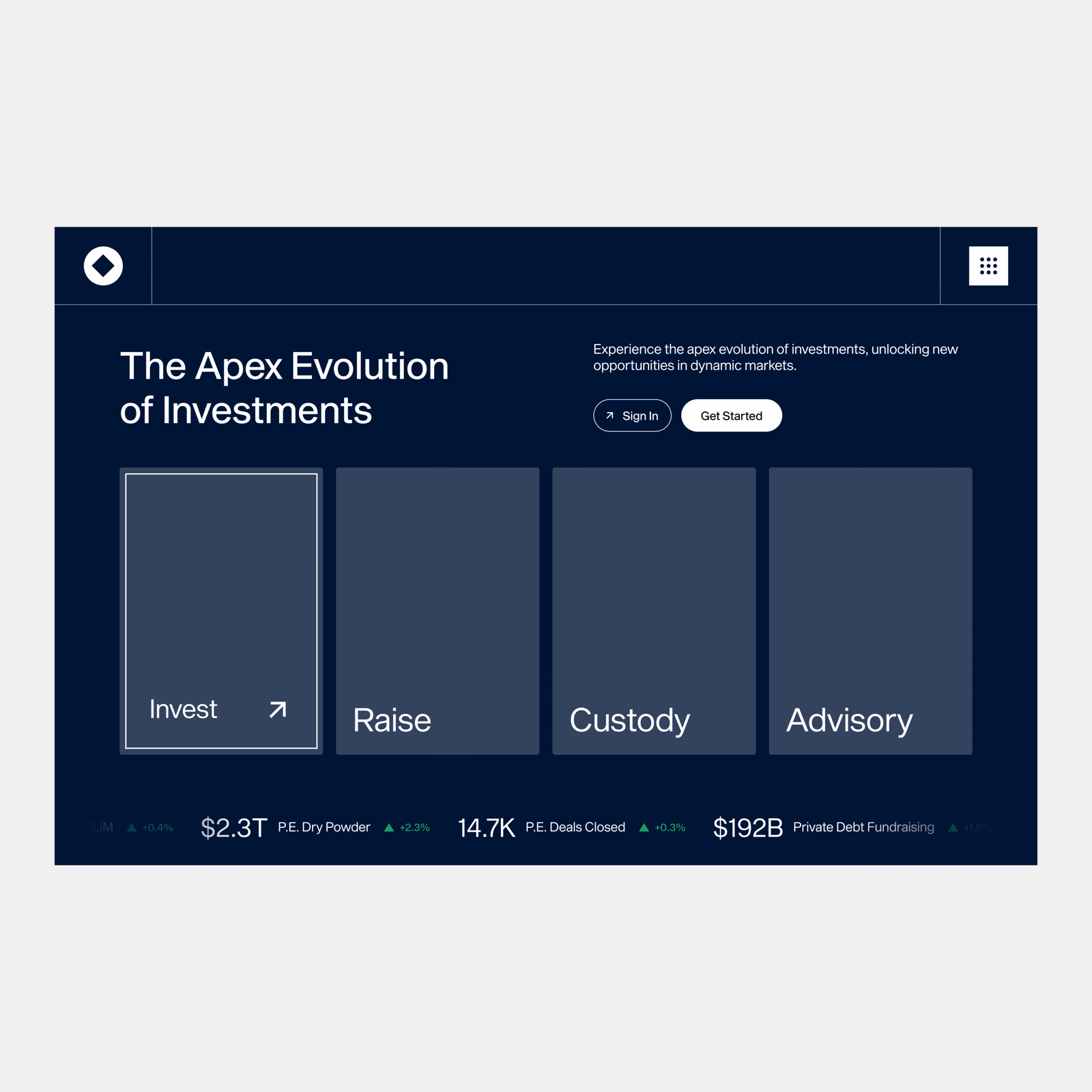
I led the design of finstreet's landing and investment experience creating an immersive four halls interface to introduce services (invest, raise, custody, advisory) and build immediate trust with investors.
UX strategy
Interactive prototyping
Stakeholder collaboration
UX engineer
Problem
New visitors arrived at Finstreet unsure of what the platform offered. They often left before exploring deeper
Services weren't clearly explained.
Early wording was generic so users couldn't tell who the platform was for.
Trust and legitimacy weren't established upfront.
In feedback, 3/5 testers said they looked for regulator logos first.
Navigation between offerings felt overwhelming.
Analytics showed 40% bounce at the hero users didn't know where to start.
I recognized this as an opportunity to reframe the landing experience so investors understood the value in seconds, built trust earlier, and felt confident to explore further.
Research
Design discussions indicated stakeholders wanted clarity and trust on first contact, so I analyzed competitor sites and ran feedback sessions with early users.
Unclear offering
New visitors couldn't distinguish services after the first visit.
Missing trust anchors
Participants looked for regulator/partner logos before exploring.
Weak separation of services
Users bounced between sections unsure where their need fit.
High above-the-fold drop
Analytics showed a significant share of users dropped without scrolling.
Solution
I designed an immersive landing flow so investors could explore with clarity and trust from the first screen.

Hero with four service tiles

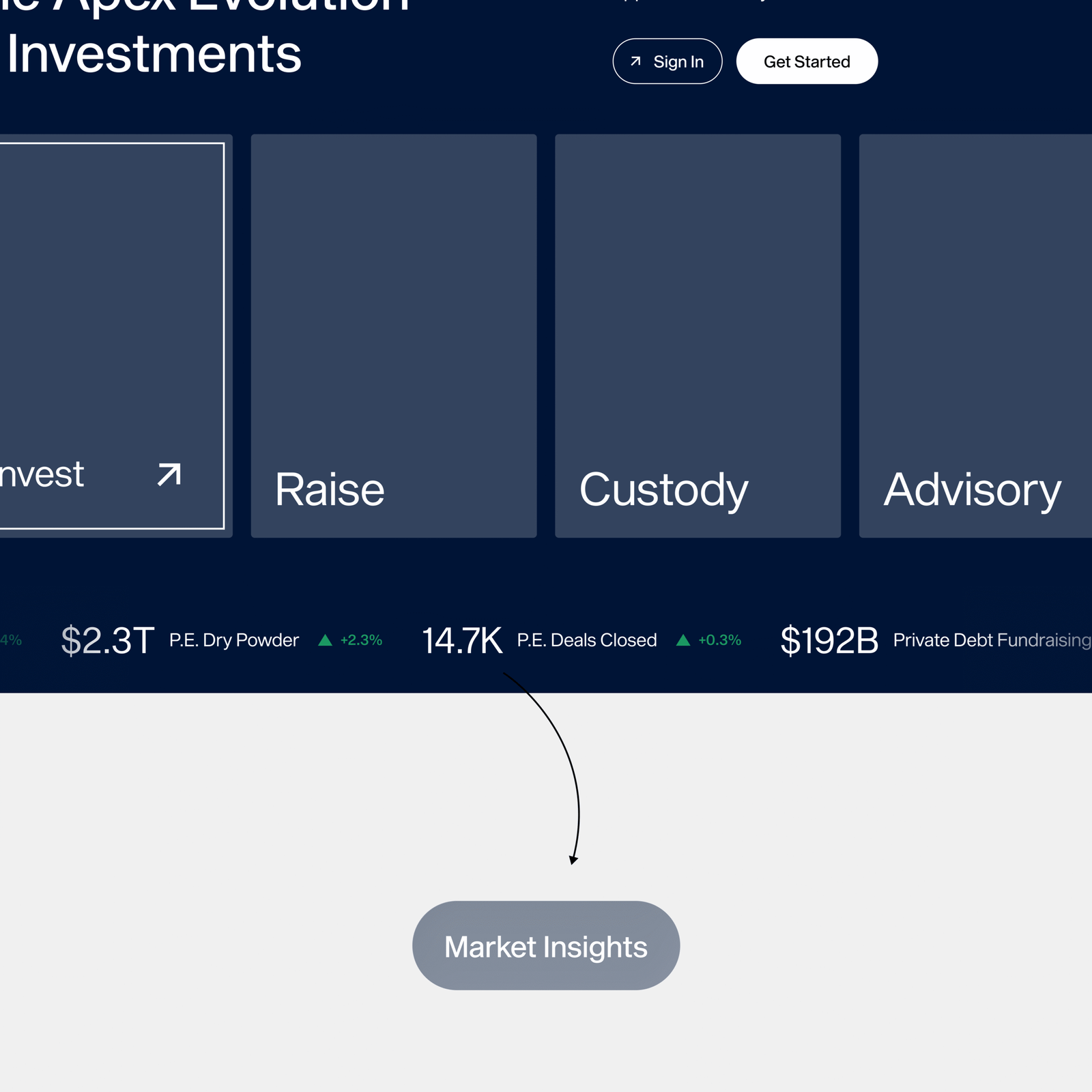
Market stats ticker

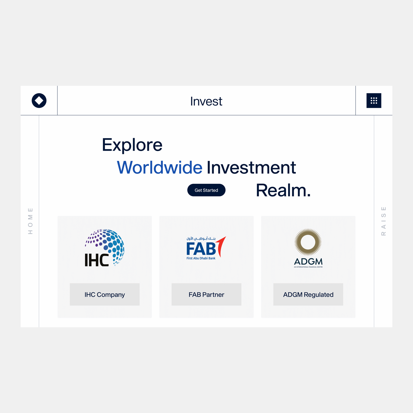
Partner and regulator logos up front

Clear service taxonomy

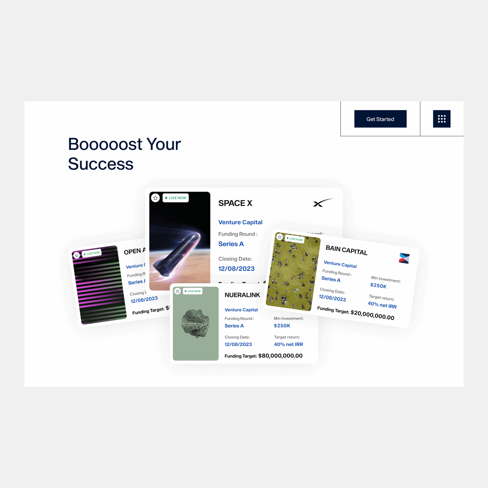
Live-now deal cards

Consistent investment cards
I focused on creating an experience where every touchpoint reinforced clarity and credibility from the first landing tile to the final investment dashboard. The goal was to build confidence early, not just design a beautiful interface.
I paid careful attention to every touchpoint so investors felt trust and direction at each step, going beyond a landing page to build confidence in the entire journey.
Explore services through four distinct doors
Invest, Raise, Custody, and Advisory each open into unique service halls with tailored content.
Build instant trust with regulatory anchors.
Logos of ADGM, FAB, and IHC are displayed upfront to reinforce legitimacy.
Market insights at a glance
A stats ticker ($2.3T dry powder, 14.7K deals closed, etc.) conveys scale and credibility immediately.
Drive action with live deal cards.
A Live Now card stack makes opportunities scannable at a glance so investors know what to explore next.
Not many things are as rewarding as seeing users interact with a product that instantly builds trust. By designing a landing that clearly separated services, surfaced credibility markers, and streamlined the investment flow, I helped Finstreet position itself as a transparent and professional gateway to private markets.
