
Visualizing the future of execution. I built a brand universe that transforms complex financial clearing into a visual language of clarity and speed.

By replacing the chaos of disconnected legacy platforms, Toolbox Trading unifies execution, risk, and reporting into one streamlined ecosystem, eliminating redundancy and reducing costs for fund managers.
Toolbox Trading is modernizing fund management with clarity and purpose.
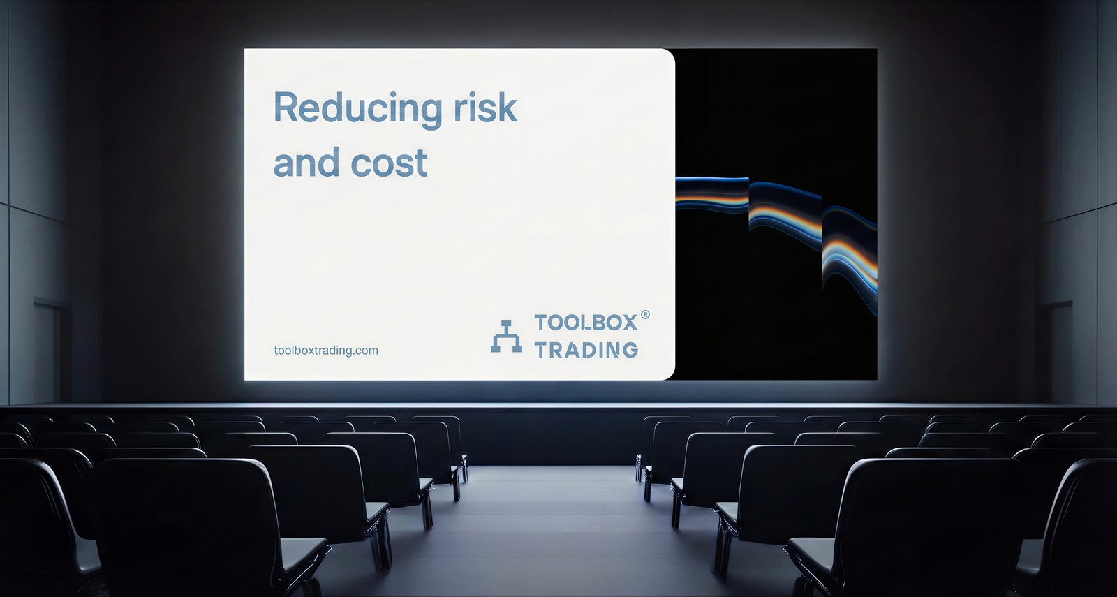
Where the industry relies on fragmented tools that create redundancy, Toolbox offers a single platform that reduces risk and costs for fund managers.
By unifying portfolios, performance, risk, and execution, it helps teams track positions, automate workflows, and move faster through a clear, scalable interface.
To align with Toolbox Trading’s mission I led a complete digital transformation.
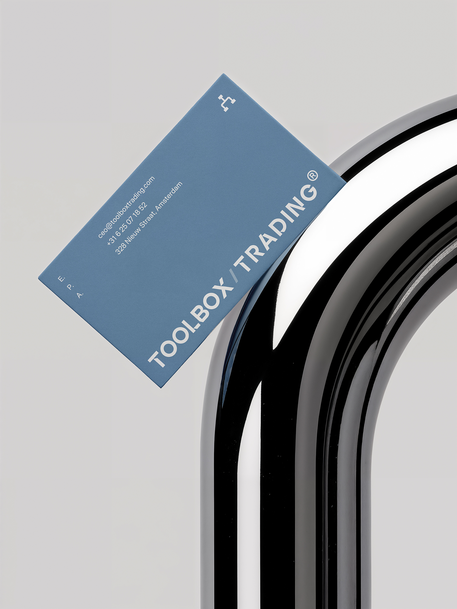
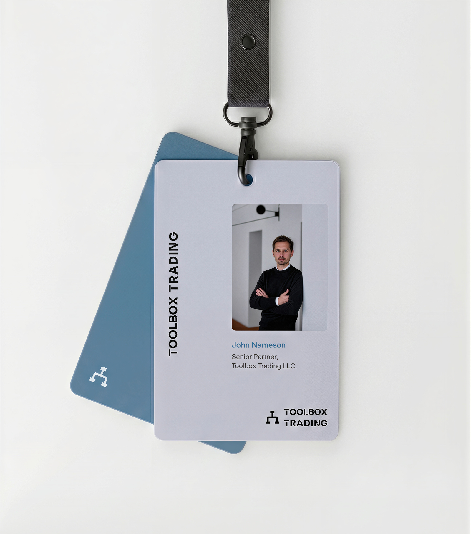
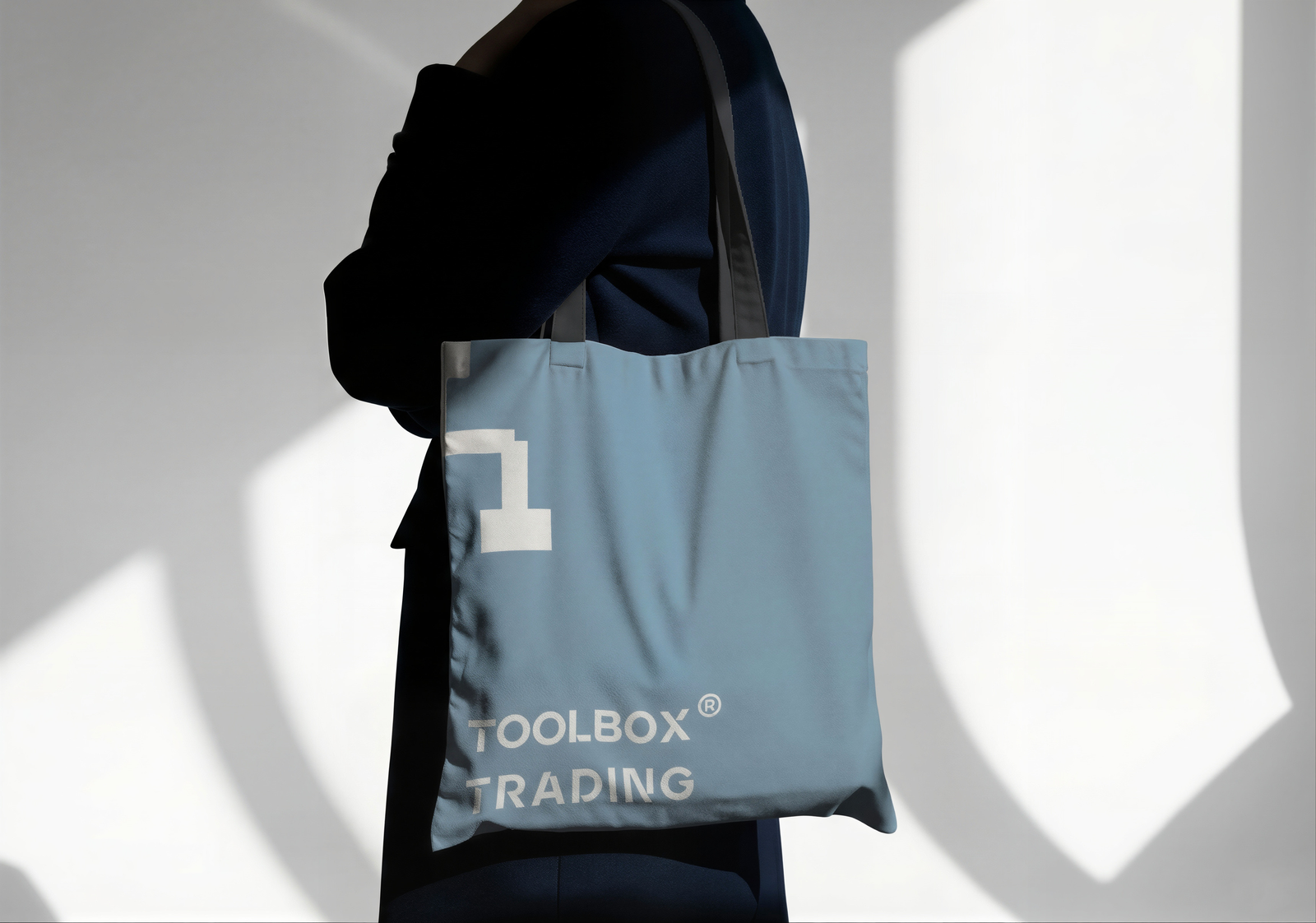
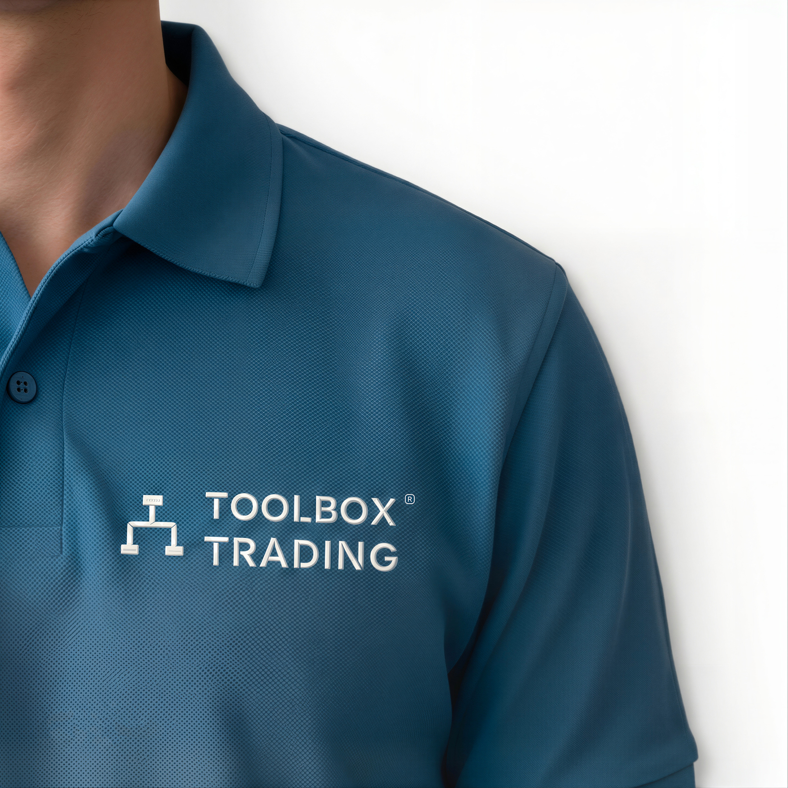
From rebranding to a cohesive Brand Universe and a user-centric website, I shaped a system that reflects their vision of precision down to the geometric node logo and structural typography.
I defined a utilitarian luxury aesthetic with Ardela Edge and a high-contrast bunker palette, moving away from generic finance tropes and positioning the product as a serious instrument for execution.
With a modern identity and stronger digital presence, Toolbox Trading now presents a brand as forward-thinking as its technology.

The perfect trading terminal doesn’t exist... or does it?
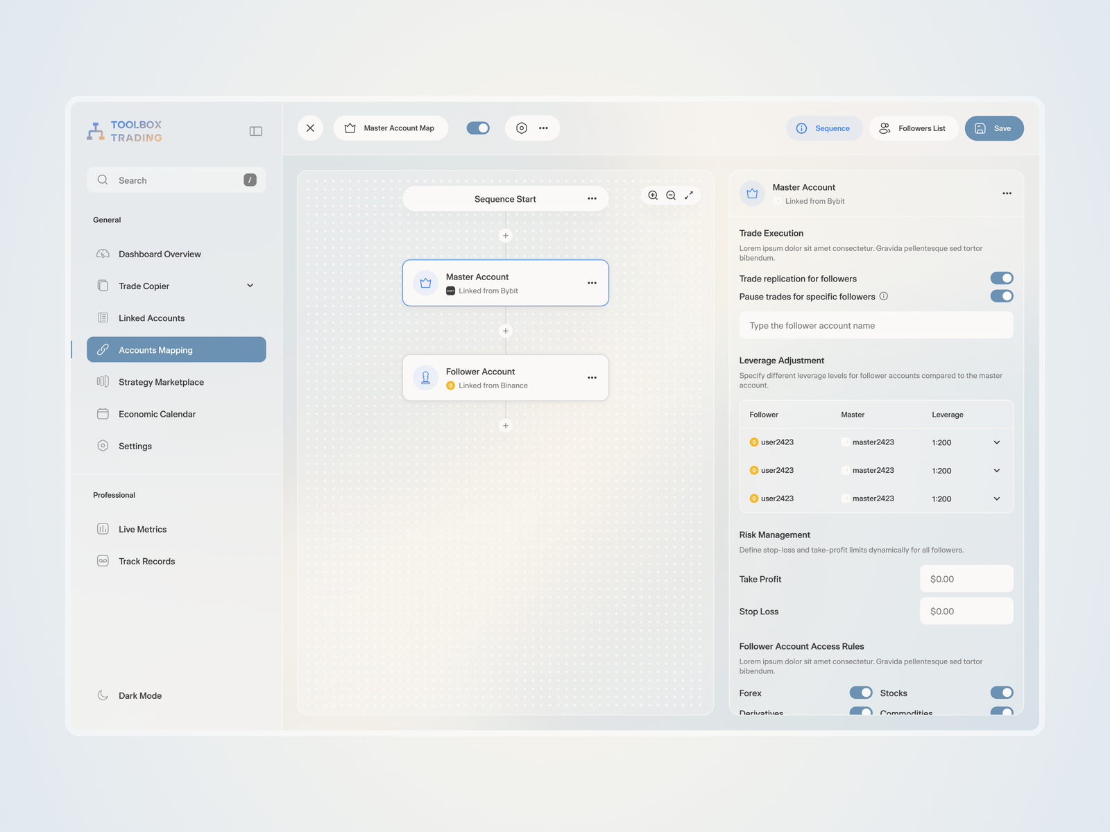
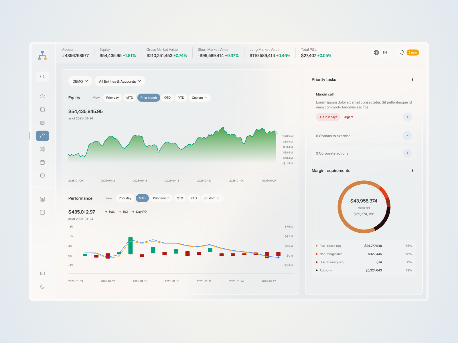
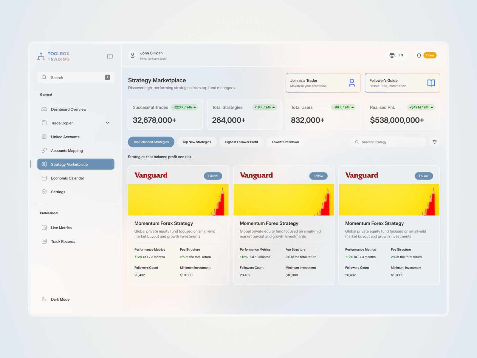
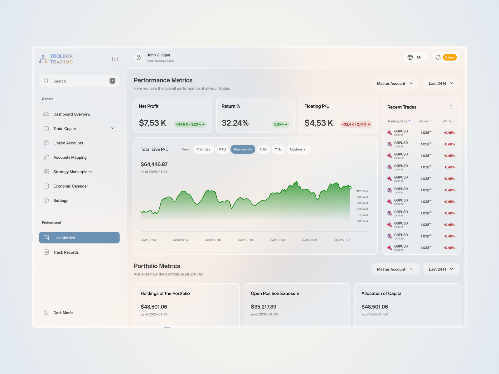
The Toolbox Trading dashboard blends sharp utility with modern performance. Built for high-stakes fund managers, it avoids gimmicks and prioritizes speed, data density, and absolute clarity.
I started with a scalable, information-first design system translating the mission of reducing risk, redundancy, and cost into how portfolios, performance, and risk are visualized, so users can act without digging through menus.
From there, I designed and implemented the product interface as a clear, scalable system for faster decision-making.
The visual language is built for endurance.
Unlike a marketing site that needs to "pop," a dashboard should sustain focus. I used the "Bunker" dark-mode palette to reduce eye strain, and reserved electric "Dodger Blue" for primary actions and execution triggers.
I replaced decoration with functional data visualization. Ardela Edge adds an engineered feel, while modular grids organize complex execution insights into one view.
The result sets a benchmark for fintech product design: precise, modern, and built to keep workflows intact while unifying execution and insights.
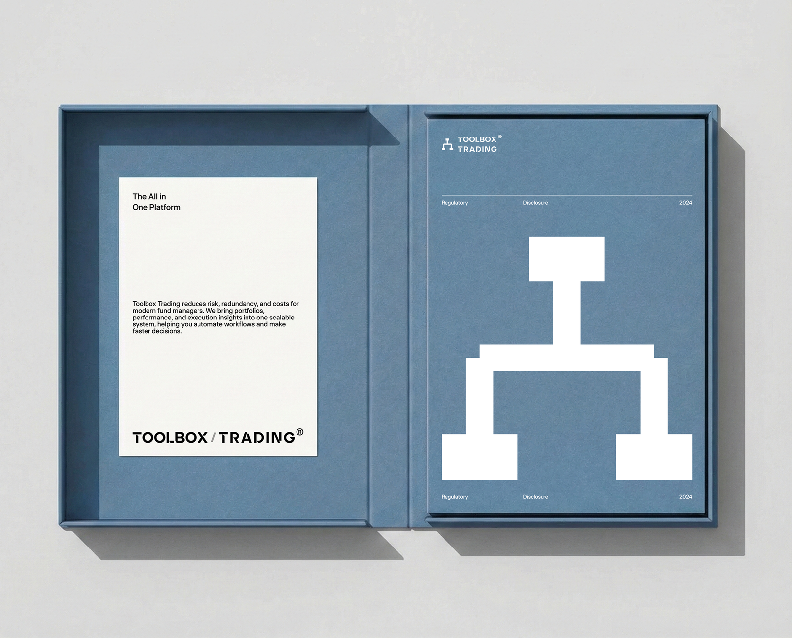
The branding process was driven by a vision to visualize "connected infrastructure.
Instead of decorative elements, I focused on structural precision. Through a meticulously crafted "node" symbol and the engineered Ardela Edge typeface, I established a tone of technical authority.
The color palette took a functional approach: "Bunker" dark tones serve as a non-distracting background for long trading sessions, while electric "Dodger Blue" was strategically deployed to highlight execution triggers. This created a monolithic, high-contrast identity designed for clarity.
Motion played a pivotal role in defining the user experience.
I moved beyond static icons to create a kinetic interface. I developed a suite of micro-animations where data points "snap" and "lock" into place, visually reinforcing the platform's ability to automate workflows and reduce redundancy.
These elements formed the foundation of a scalable design system. By treating the brand guidelines as a "rulebook for builders," I ensured that as the platform grows to encompass more portfolios and insights, the interface remains a cohesive, unified tool for the modern fund manager.
